
Introduction
A major multinational telecom provider started a strategic shift toward mobile-first communication by moving away from traditional desk phones. In response to the growing needs of modern businesses and users, they partnered with our leading technology firm to build a robust mobile communication solution that supports advanced voice services and cloud-based infrastructure.
As the design lead for this initiative, I was responsible for overseeing the complete UX and UI design process and guiding the design team to deliver an intuitive, user-friendly experience. We built the solution to support flexible, enterprise-grade calling environments, tailored to fit diverse usage scenarios and communication needs across organizations.
To meet the urgency of launching the application quickly while maintaining quality, the team structured the development into five strategic phases. This phased approach enabled early releases, allowed continuous feedback, and ensured that the solution grown in alignment with both technical goals and user expectations.
About Company
It is a leading digital infrastructure provider, operating one of the world’s largest networks of data centers and interconnection platforms. The company enables organizations across industries to connect, scale, and speed up their digital transformation securely.
Project Overview
The project focused on creating a ticketing tool tailored for data center operations. This platform allowed teams to log, prioritize, and resolve issues ranging from equipment failures to network disruptions. The tool improved efficiency, reduced downtime, and ensured effective handling of critical incidents by streamlining task assignment and communication.
Problem Statement
During research, several challenges to existing ticketing tools became clear. These issues not only slowed down operations but also created frustration for both direct and indirect users:
- Lack of real-time updates made it difficult for teams to stay aligned on ticket progress.
- Cluttered or inconsistent data logging prevented users from quickly understanding the context of an issue.
- Limited filtering and search capabilities made locating specific events or actions time-consuming.
- Poor role-based customization and ineffective visualization often led to miscommunication between teams.
- Weak notification systems, missing integrations with other tools, and limited export options meant users risked overlooking critical updates or audit requirements.
- No built-in analytics prevented teams from measuring resolution times or identifying bottlenecks.
- Insufficient privacy controls raised concerns about data security and compliance.
In short, existing tools lacked transparency, efficiency, and flexibility. We needed a simple and flexible way to manage tickets to improve communication, track responsibility, and get useful information.
Project Goal
The goal of this project was to simplify ticket management by providing teams with a clear, chronological view of a ticket’s history. By introducing a ticket timeline, we aimed to reduce delays and miscommunication caused by scattered updates, enable faster context understanding, improve collaboration across teams, and ensure smoother resolution of issues while maintaining SLA(Service Level Agreement) compliance.
Design Process
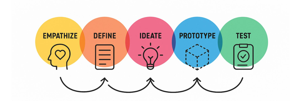
User Research
To design a solution that truly addressed user needs, I began by identifying and connecting with individuals who interacted with the ticketing tool in different capacities. Through one-on-one discussions and observation sessions, I aimed to understand their workflows, challenges, and expectations from the system.
During this phase, I categorized users into two primary groups:
Direct Users: These included technicians, engineers, site staff, and site managers who were directly involved in creating, updating, and resolving tickets. They often collaborated across teams and needed a seamless way to track progress and maintain clear communication throughout the ticket lifecycle.
Indirect Users: This group comprised individuals who used the ticketing tool for monitoring, analysis, or research purposes. While they were not actively resolving tickets, they relied on accurate timelines and structured data to review trends, ensure compliance, and support decision-making.
Understanding the distinct needs of both user groups helped define the foundation of the design, ensuring the tool was not only efficient for operational users but also insightful and transparent for analytical and supervisory roles.
User Persona
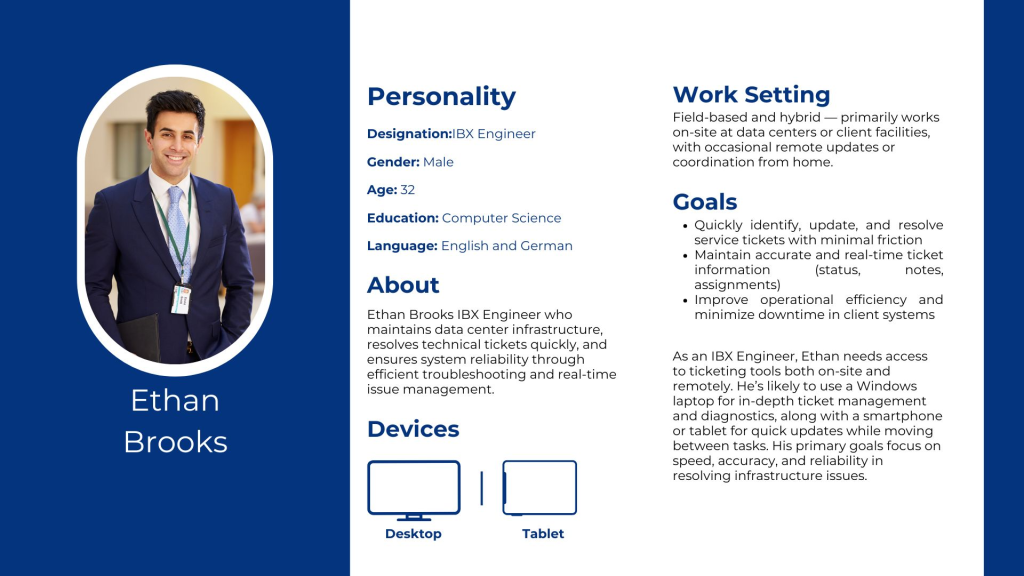
Ethan Brooks – IBX Engineer
Ethan Brooks is an IBX (International Business Exchange) Engineer who maintains data center infrastructure, resolves technical tickets quickly, and ensures system reliability through efficient troubleshooting and real-time issue management.
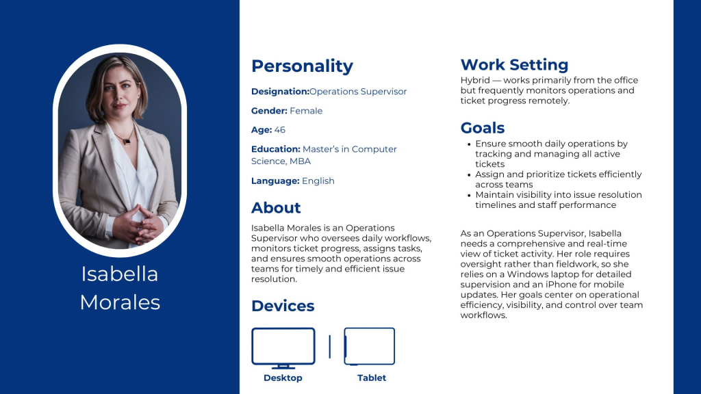
Isabella Morales – Operations Supervisor
Isabella Morales is an Operations Supervisor who oversees daily workflows, monitors ticket progress, assigns tasks, and ensures smooth operations across teams for timely and efficient issue resolution.
Current Design
The existing tool was built on Oracle Siebel, an older platform with limited flexibility. As part of the upgrade, we identified an opportunity to enhance the overall user experience by redesigning the interface using Equinix’s custom design system. Leveraging modern technology and updated UI components allowed us to create a more cohesive, intuitive, and scalable experience aligned with the company’s latest design standards.
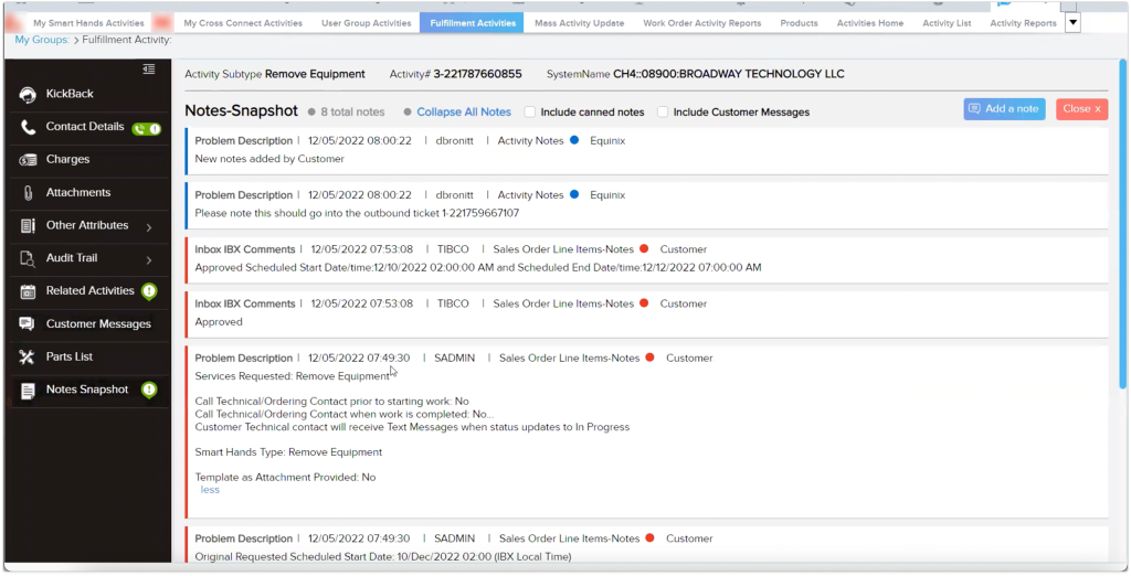
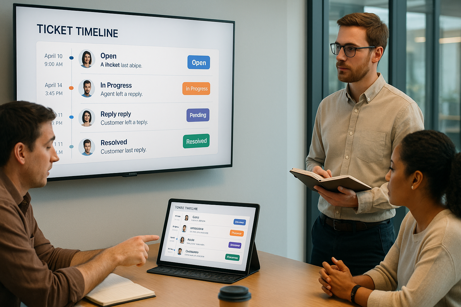
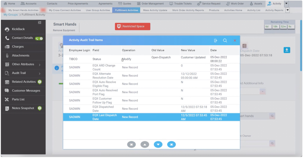
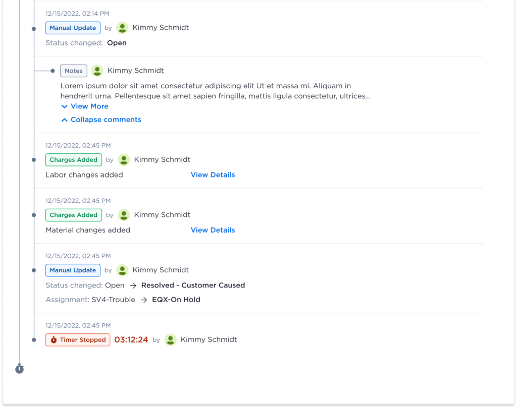
The audit trail functioned as the ticket timeline, capturing detailed records of each action taken on a ticket, including updates made at different stages and by different team members. This ensured traceability throughout the ticket’s lifecycle.
Redefining the Ticketing Workflow
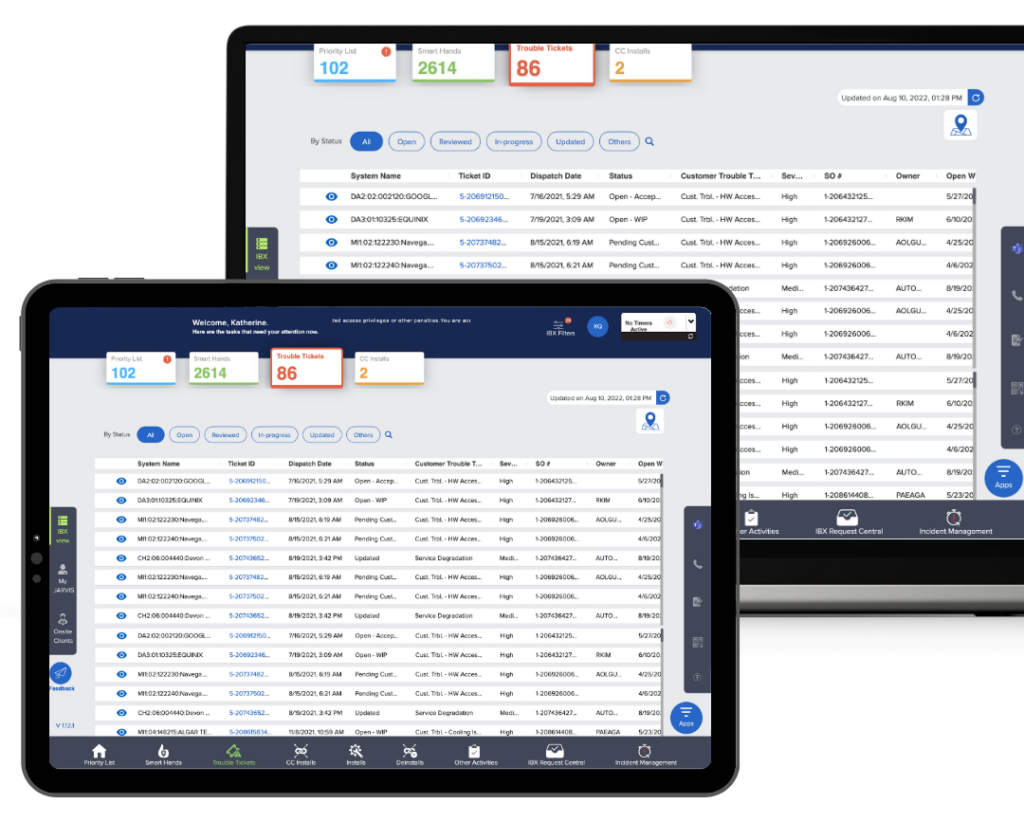
When users click on the Trouble Ticket tab, they can view all the tickets that have been raised across different organizations. This provides an instant overview of every ticket along with its current status, allowing users to quickly assess ongoing issues and prioritize actions as needed.
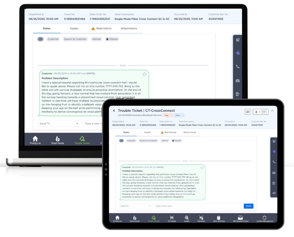
When a user opens a ticket, they can view comprehensive details, including all associated notes with timestamps and dates, the assets involved, their current status, and related functional activities. The view also highlights any access restrictions for the IBX or cabin, ensuring proper authorization. Additionally, all attachments are organized with corresponding time and date stamps, providing complete traceability from installation through each stage of the ticket’s progress.
The ticket timeline was placed prominently within the ticket view, alongside other key information tabs. This allowed users to easily access and review the ticket’s complete history and details without navigating away from the main screen.
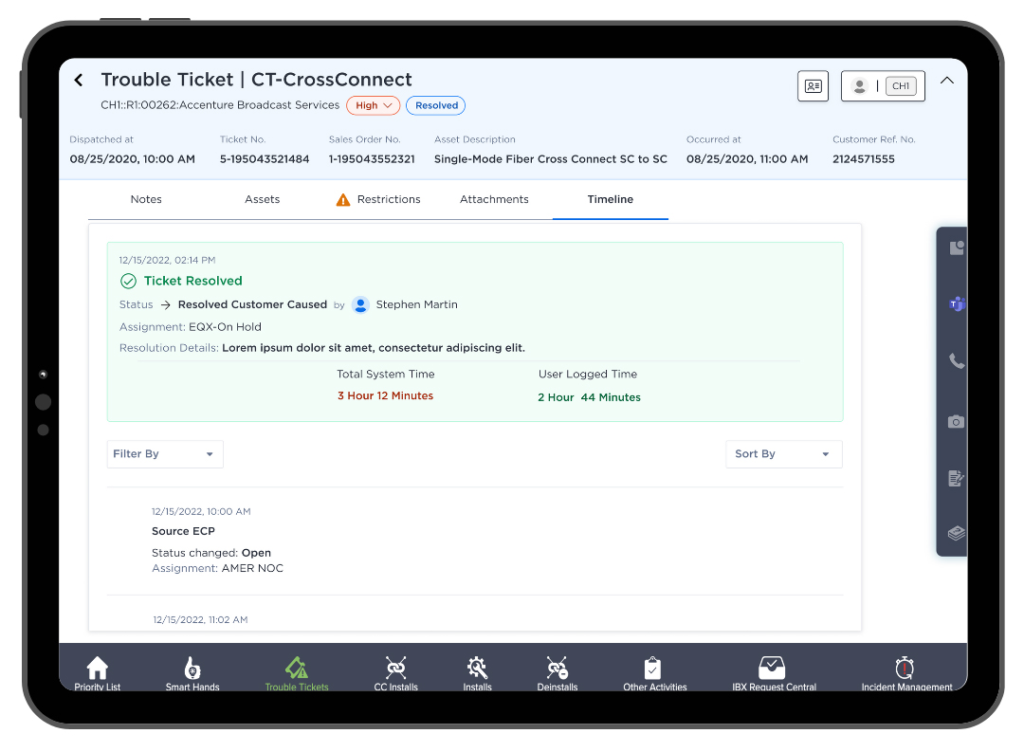
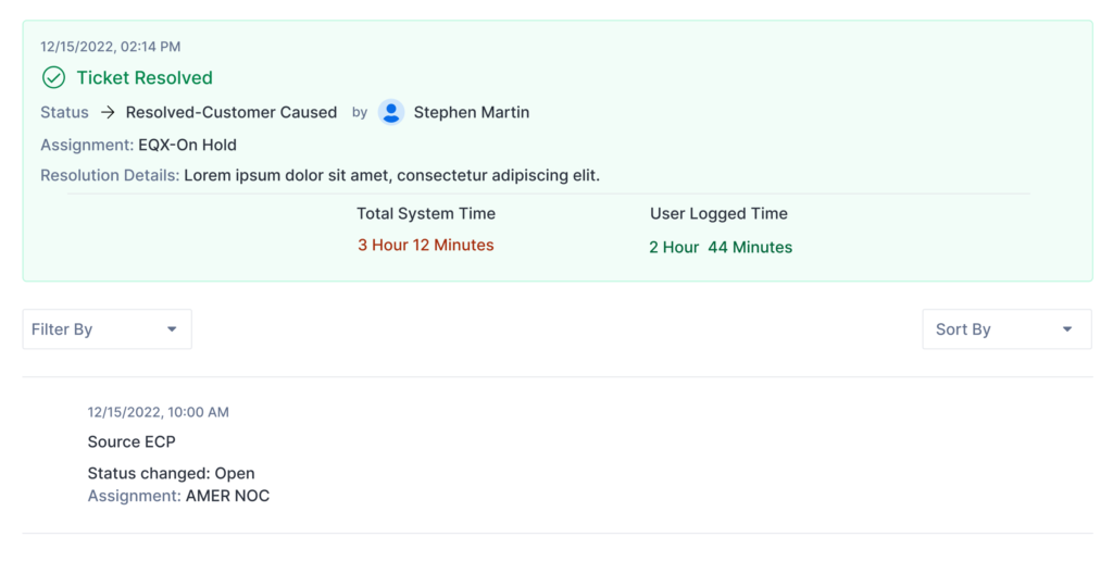
The current ticket status was brought to the forefront, along with key details such as the assigned handler, responsible department, resolution progress and filter. Presenting this information upfront enables users to understand the ticket’s status and ownership at a glance.
Each step within the ticket was tagged with a clear process name, along with corresponding date and time stamps, department details, and the assigned engineer. This structured labeling allows users to easily filter tickets based on specific criteria, such as process or engineer. The inclusion of timestamps also enables efficient sorting, helping users quickly track progress and review ticket activity in chronological order.
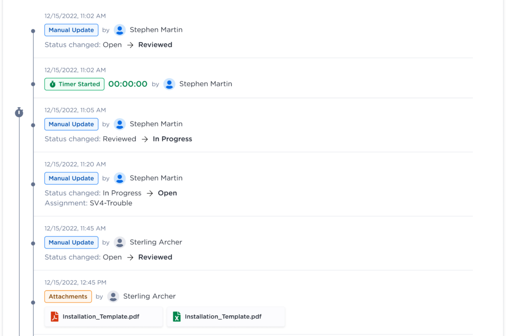
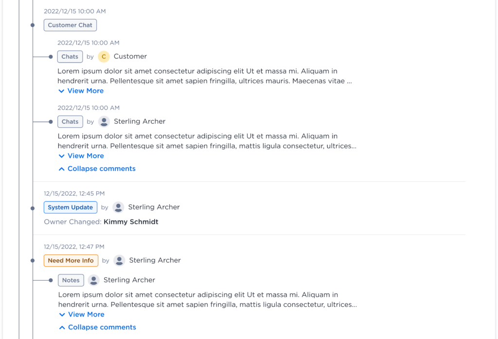
Expandable and collapsible Notes and Chats sections were introduced to keep the ticket view concise and easy to navigate. Users can quickly scan essential information, and when more detail is needed, they can simply expand the section to view the complete conversation or notes.
When a ticket is closed, the system displays detailed closure information including who resolved the issue, the nature of the problem, and which department handled it. It also provides a summary of the total time taken to resolve the ticket, offering clear visibility into performance and resolution efficiency.
User Testing
For user testing, I collaborated with the User Research team to conduct structured usability sessions. Participants were provided with a working Figma prototype of the tool and were asked to navigate from the Trouble Ticket section through to the Timeline view. The sessions included a set of predefined tasks to evaluate ease of navigation, clarity, and overall usability.
After completing the tasks, participants answered a series of open-ended questions to share their impressions and feedback about the tool. Finally, they were asked to rate their experience on a scale of 1 to 5 (with 5 being the highest) and suggest any additional features or improvements they felt could enhance the overall user experience.
Design Challenges
Throughout the design process, we encountered several challenges that required close coordination and a deep understanding of both the system and its users:
- Cross-Team Collaboration: Coordinating with multiple teams across different departments and regions to gather and align requirements was a key challenge. Ensuring consistency in understanding and expectations required continuous communication.
- Understanding Departmental Processes: Gaining a clear understanding of how each department operated and interacted with the ticketing tool was essential to ensure the design met diverse operational needs.
- Learning the Ticketing Workflow: Building a foundational understanding of how trouble tickets were created, tracked, and resolved helped in identifying opportunities for improvement.
- Data and Process Segmentation: Categorizing data, mapping processes, and creating appropriate tags within the ticket timeline required careful planning to maintain clarity and usability.
Key Takeaway
This project enhanced my ability to simplify complex workflows into intuitive, user-friendly experiences. Collaborating across global teams taught me the importance of clear communication and empathy-driven design. By introducing the Ticket Timeline and implementing design system, we improved usability, reduced miscommunication, and increased overall operational efficiency.